


The HR Employee Benefits department at Sherwin-Williams needed an easy-to-use system for maintaining their own content with the upcoming Open Enrollment season. The department was also in need of an intuitive user interface to reduce user confusion thus reducing the number of employees calling into the department with questions.
Employee Benefits received their own project within the organization's CMS to maintain and update their time sensitive content with minimal direction.
The department experienced a 15% reduction in employee question calls within the 1st month after deployment.
They were very satisfied with the results - not only did they end up with a user-friendly content solution, but their users, the employees, gained an informative and valuable resource for all their employee benefits questions.
The Field Service Engineers needed a virtual system that would allow them to find spare parts where ever they might be in the world at whatever time of day or night on a service call without depending on the Customer Support department.
Here are the objectives of the expandable, visual hierarchical system, eSPF.
With the first implemented Nuclear Medicine systems deployed, eSPF was well received by the Field Service Engineers.
"eSPF is just the system we needed. It saves so much time with minimal effort."
Legacy systems are still be imported into eSPM today.
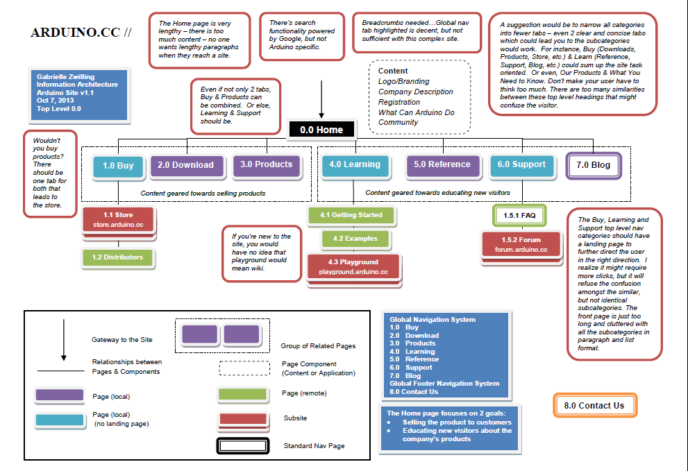
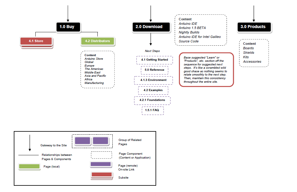
The confusing global navigation of the Arduino.cc caused a higher bounce rate than the company had anticipated leading to an Information Architecture analysis and proposal.
Arduino.cc is in need of help for their entire navigation system. The site needs to increase its learnability as it could be very confusing to a new visitor whose accustom to a specific set of standards when navigating the web. The visitor could easily get lost within seconds and become frustrated enough to leave Arduino.cc altogether.
The product is complex enough that the site should enhance its navigability to build a better understanding with the potential customer to ease them effortlessly into the new technology.
To begin, the global navigation system should be simplified with a reduction in the number of navigational tabs. This might clear up any confusion pertaining to the differences between highly correlated terms (Buy, Download, Products) on the tabs. By grouping all content for selling products together and all content for educating new customers together, an intuitive and effective organization schema could be implemented.
Next, a site-specific search system needs integrated into the global navigational system.
Customizing this feature versus using Google would be a solid investment as Arduino is a company that relies primarily on their site for selling products.
The major search engines are not capable of optimizing the context of every site sufficiently. The content owners of the site have a solid grasp of the industry concepts, jargon and product line to build an efficient search system. Plus, the user does not necessarily want to see Google across their site search results; they would want to see that they are still active on Arduino.cc.
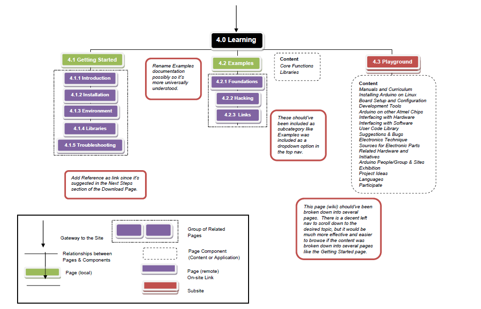
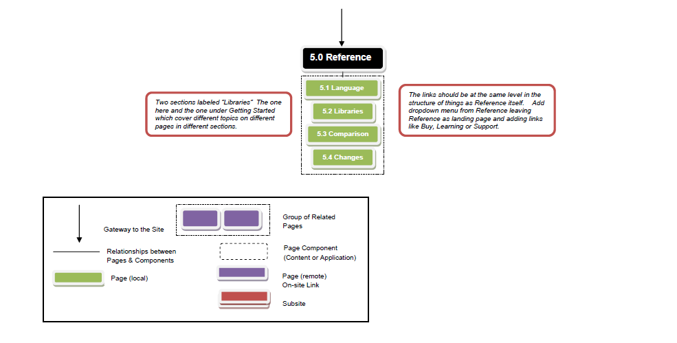
The final step to prevent any navigational problems would be the implementation of breadcrumbs across the entire site. When the user visits a page now, the primary navigational tab is highlighted, but beyond that, there is no other indication for where the user is on the site. Before adding the breadcrumbs, there are several links that need to be re-organized. For instance, there could be a navigation dropdown menu for Reference, Language, Libraries, Comparison, and Changes as we see with the Buy or Support sections. Another idea would be to include Foundations, Hacks and Links along with Examples in the dropdown menu under Learning. Once any confusing structure issues are straightened out, the breadcrumbs can be efficiently set up to support the site.
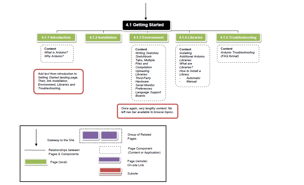
Besides the faults of Arduino.cc, the site does have several strengths. Beyond its crowded pages, the content is solid – it just needs to be rearranged so that the users can thoroughly benefit from what the company has to offer. Also, the Getting Started section is a great value added guide for welcoming new customers.
CHC Physical Therapy and its web properties, Body Phyx, Golf Phyx, and the Performance Phyx, needs updated for the new era - to create a consistent "look and feel" across the CHC brands and to provide an engaging and enjoyable experience for the end user.
According to Jesse James Garrett, the field of User Experience covers a wide range (from conception to completion) of elements:
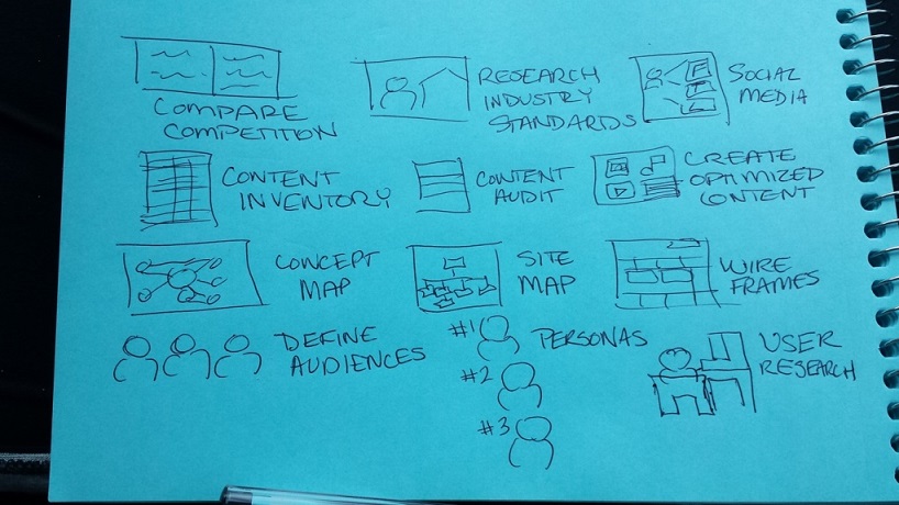
As a solo designer for this project, I've brainstormed about the various elements that go into the creation of the optimal user and have drawn the following sketch - aligning aspects of Garrett's elements with today's digital landscape.
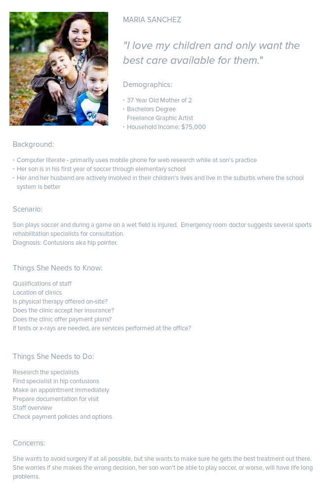
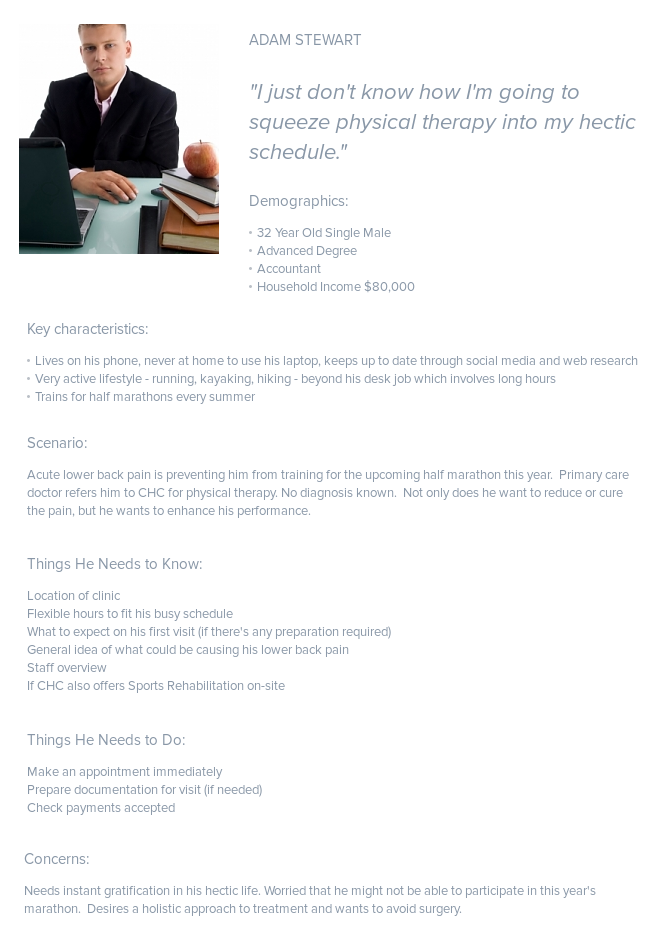
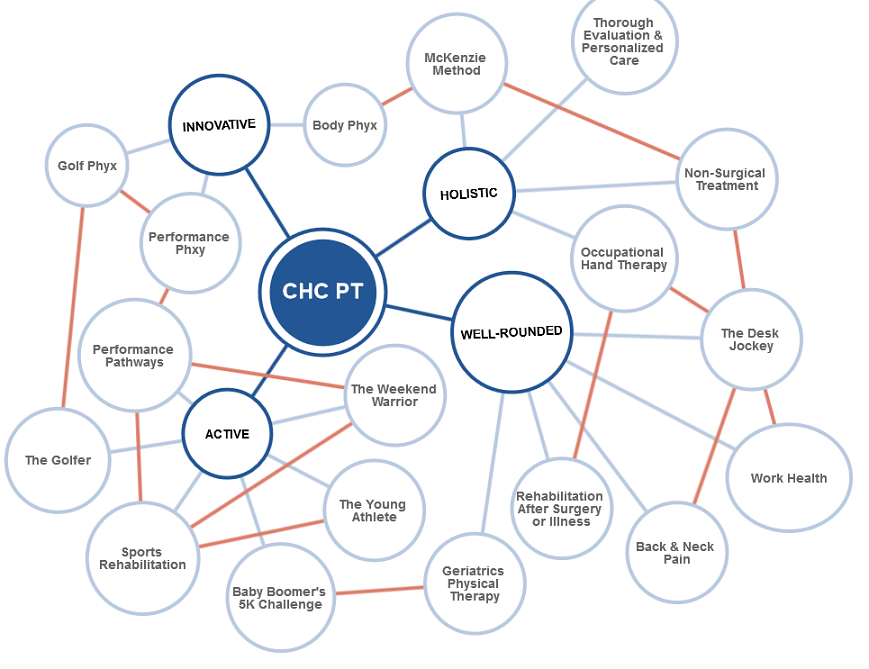
The client already has 4 pretty well-defined target audiences that it wants to re-purpose its site content around - The Golfer, The Young Athlete, The Baby Boomer, and The Weekend Warrior. Later in the process, I researched and found a 5th target group - The Desk Jockey - which the client has decided to implement.
Energized and powerful (sports physical therapy) meets compassionate and natural (holistic wellness approach)
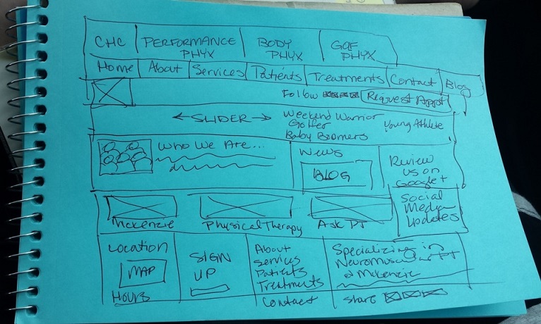
Here is a sketch of a potential wireframe incorporating the sister brands into the Home page of CHC. This variation could improve brand consistency across all web properties.
For the following CHC prototype , I thought I would work with my Axure RP Pro 7.0 software. This page illustrates the standard conventions and maintains the separate identities of the target audiences.
Unfortunately, I did not get to see my project through until the end due to personal reasons.