


July 20-22, 2023 | A case study on user research for Jen's Psychiatry Services,a mental health care provider's online presence.
A local psychiatric services provider approached me with building her branding as well as a website for her small business. Jen recognized her internet presence is currently spread across a variety of resources - reviews on Facebook, provider listings on Psychology Today, ZenCare, ZocDoc and Headway.co, etc and wants to create a unified online presence. After viewing a fellow provider’s newly designed site, she was inspired to further invest in her own site.
The branding for her business would need to highlight her unique selling proposition in the fiercely competitive market. What would make someone choose Jen over thousands of other providers across the nation? What image does Jen want to convey to her potential clientele?
After secondary research - competitive analysis and user data research, the top concern for potential visitors seeking mental healthcare is trust. Trust is a crucial aspect in attracting and retaining patients as mental health is very sensitive and personal topic and individuals seeking help want to feel confident in the provider they choose.
Compassion needs conveyed and is the second most important factor in designing and developing a site for individuals seeking mental help. They visit in hopes of finding a trusted provider, but typically in a sensitive state and a place where they fear judgement in their vulnerability. They are seeking a provider who they believe genuinely cares about their well-being and conveying compassion can provide a warm welcome.
Trust can be built on a mental healthcare provider website through transparency. Transparency can be demonstrated on the site through:
To practice empathetic design, we need to demonstrate compassion and sensivity to our potential visitors. They need to know that their voices are heard and that we understand the challenges they are facing when seeking support online. A warm, compassionate experience can be supported by implementing these basic concepts and features on our site:
Jen needs a transparent, collective site that showcases her credentials, endorsements and experience in one place and builds trust and credibility in her online presence. The user experience should be compassionate, warm and welcoming to create a safe place for people in their most vulnerable moments.
The Early Ideation will provide me guidance in addressing the objectives. The project is in its early phase - wireframing is in the works.
July 27-28, 2023 | A case study on Information Architecture for Jen's Psychiatry Services, a mental health care provider's site.
After researching competitor sites - psychiatry service providers, I found inconsistencies in the Information Architecture. Either the structures were overly cluttered (containing too many menu items) or they were too simple (having only 3 menu items). I wanted to find a happy medium - ensuring to cover all sections while not confusing the visitor.
When a care seeker decides to take action, they may or may not be in a distraught state. Either way, the last thing you would want is for them to feel isolated by overcomplicating things and potentially making them feel incompetent if it is too hard to find information or overwhelmed with unclear and unstructured content. The plan would be to gently guide them through the decision making process without removing their sense of control in the situation.
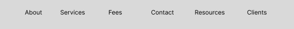
The menu items need to be setup in a logical progression. I know the process of consuming site content is not always sequential and not all users will start at the first menu item so the nomenclature of the items should speak for themselves independent of the decision based Information Architecture.
A potential patient visiting the site might follow the decision making process as follows:
The users will be provided with links to the next section as page navigation on the bottom of each page to gently guide them through their decision making journey.
February 15-22, 2002 | A case study on modernizing the design and reviving the content of my portfolio.
A portfolio is required to apply for the Design CoP within the US Digital Services. They want applicants to demonstrate design thinking and to document their thought process.
After deciding to apply for the Design CoP, I knew I needed to revitalize my portfolio. I don't get the opportunity very often and I get around to redesigning every 4 years or so. The content was antiquated and the look and feel needed a makeover.
Unfortunately, due to the nature of my employment, there is very little that I can share to the public. It's very disheartening as I can't display 7 years of design and development over 20 projects as a demonstration of my work.. I would love for my portfolio to land me a job where I can finally share my work with the world.
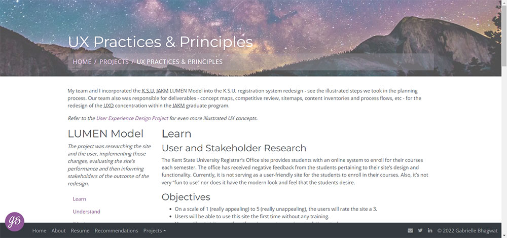 My Portfolio 2018
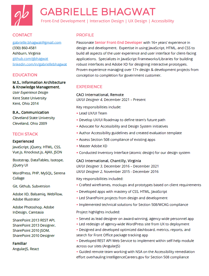
Fortunately, I recently started reviving my branding in a new version of my resume.
Color Palette --- I chose a purple and pink palette as it's very vibrant and lively. Both were backed by color psychology - Purple can be connected to creativity and wisdom. It actually stimulates the brain activity used in problem solving. Whereas pink with its bright and cheerful appearance signifies hope. Someone seeing the world through rose-tinted glasses are seeing it with excessive optimism. I believe creativity and optimism.
Typography --- I chose Open Sans as my all-time favorite Sans Serif that paired well with Montserrat - my favorite Serif in the moment.
Navigation & Context --- I chose to narrate my journey through UX and design while showcasing my work. From dreaming of being a imagineer to my first role at CACI, I wanted to really demonstrate all my career dreams and goals that led me where I am today. I'm ready to take the next step in that journey. My ultimate dream job is to design the UX and UI for sites that reach thousands of users in a rewarding role with purpose. I want the role that I imagined when I first graduated with my Masters in UX back in 2014.
Protoypes --- Before this rennovation, I was in the process of creating the Adobe XD prototypes to incorporate my new branding into my portfolio. So, the timing worked out well.
I extensively researched other UX/UI Designer and Front-End Developer portfolios for inspiration as to the amount of work showcased, navigation, branding and UX. I wanted my USP - unique selling proposition - to be that I'm a Full-Stack Designer. I'm a UX unicorn that has expertise across the front-end. I'm a designer that can code. From accessibility to designing the UX and the UI - and in the end, bringing my design to life through development. Building the pages and components as well as programming the microinteractions to provide users with an engaging experience.
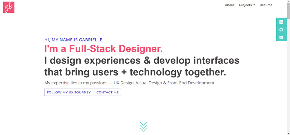 The Final Product 2022